Mapping the Current Funnel
I partnered with our data scientist to analyze user behavior from app entry through subscription completion, revealing two key insights:

1. Untapped High-Traffic Opportunity
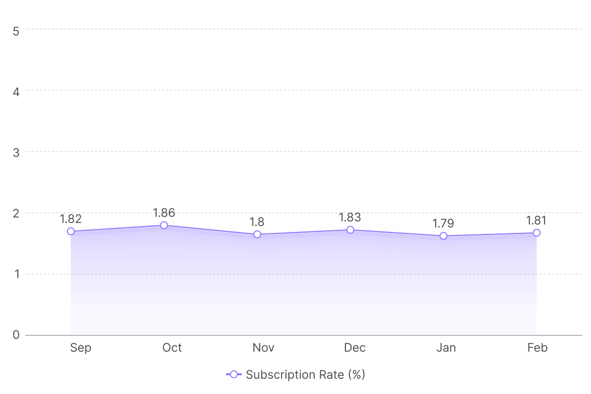
Our data revealed the article flow attracted 6x more users than the magazine flow, showing strong preference for article content.
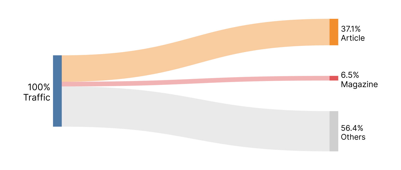
However, this high-traffic flow had 55% lower conversion rates than magazines.
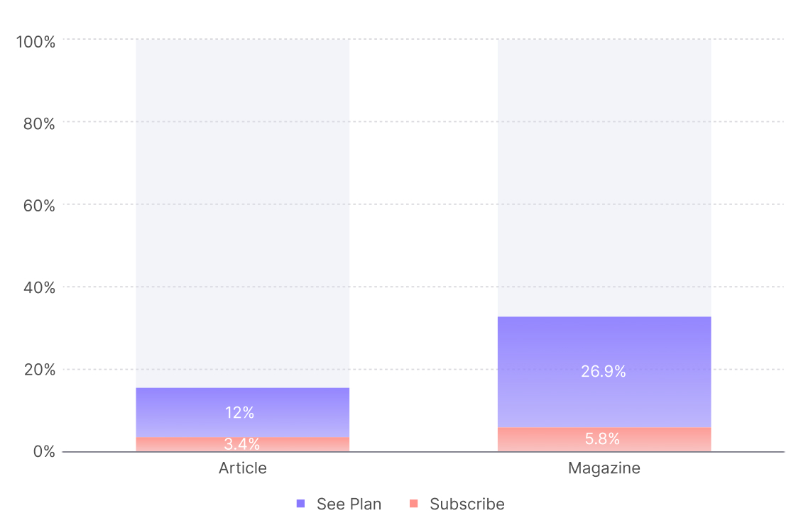
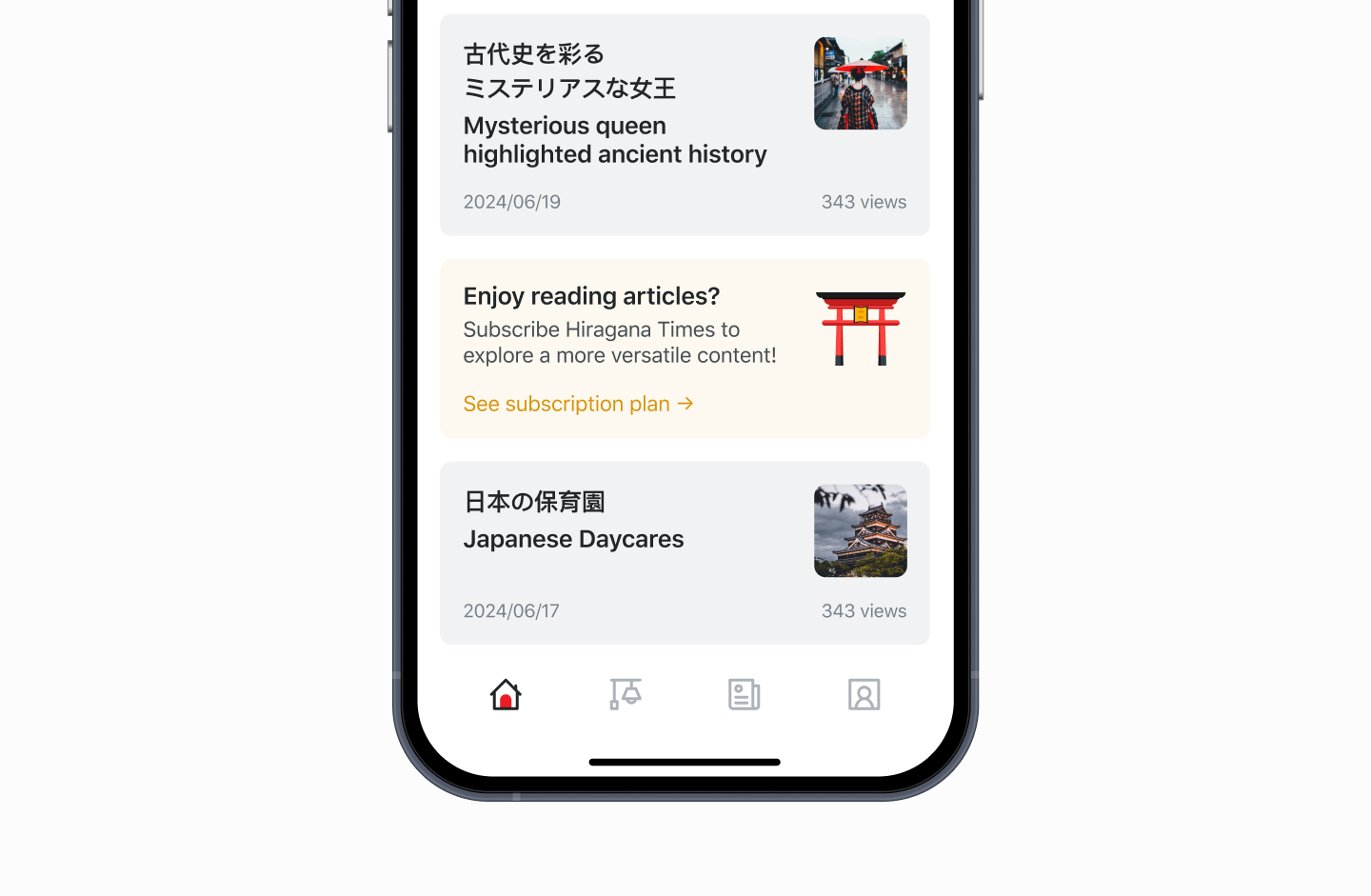
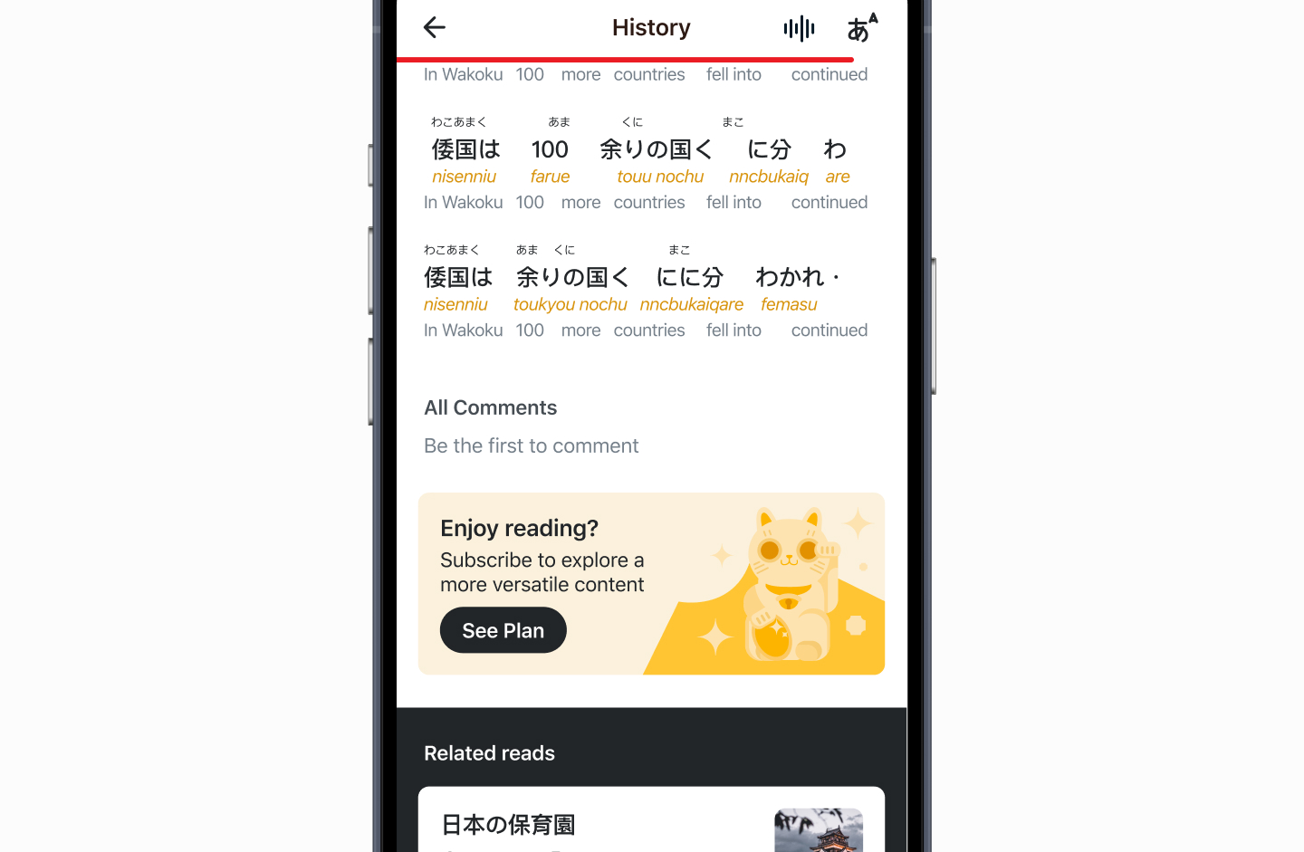
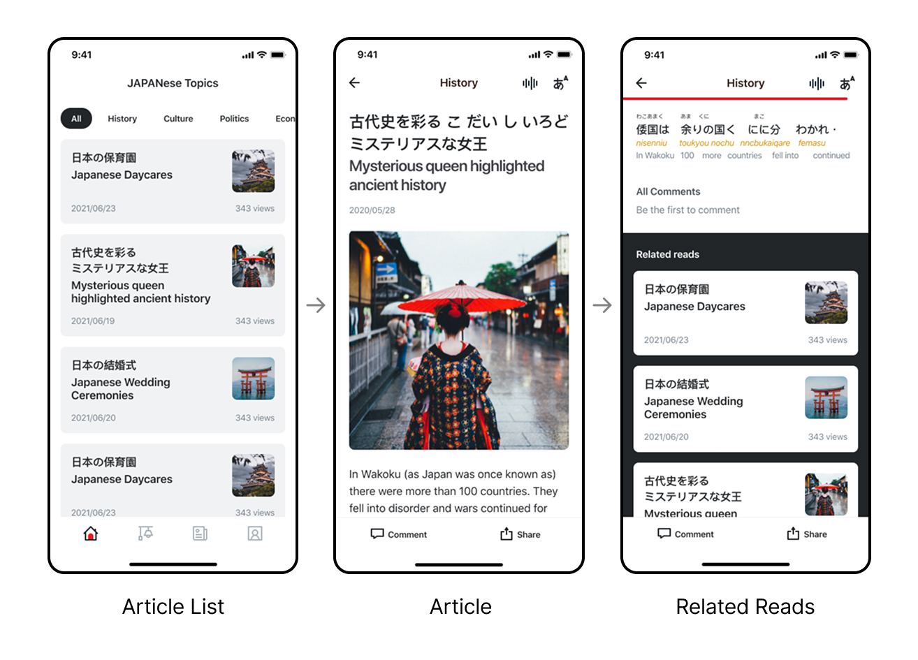
When we mapped the article reading journey, the issue became clear: users could browse and read content but encountered zero subscription prompts. The journey simply ended without conversion opportunities.
2. Misaligned Business Priorities
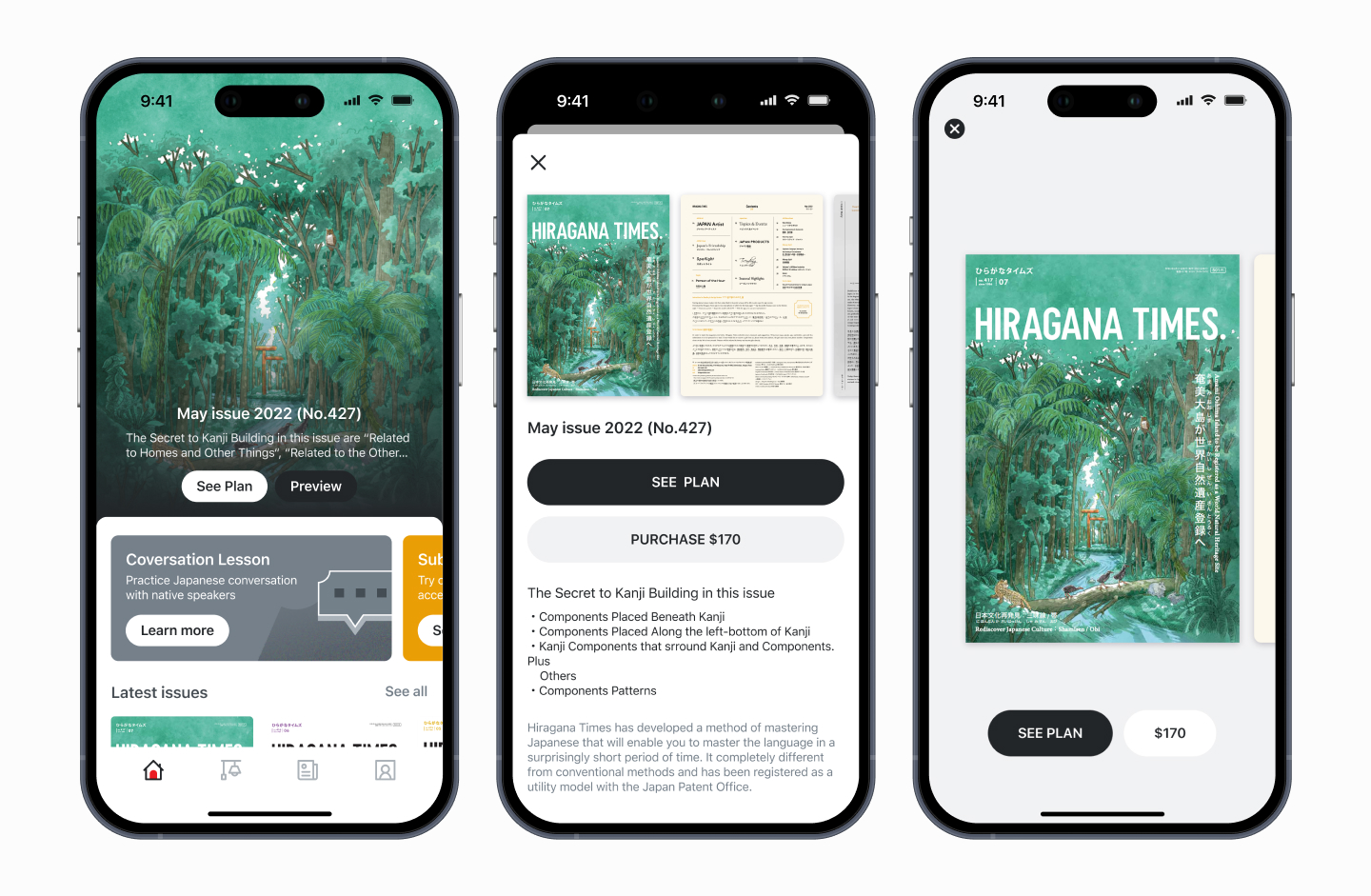
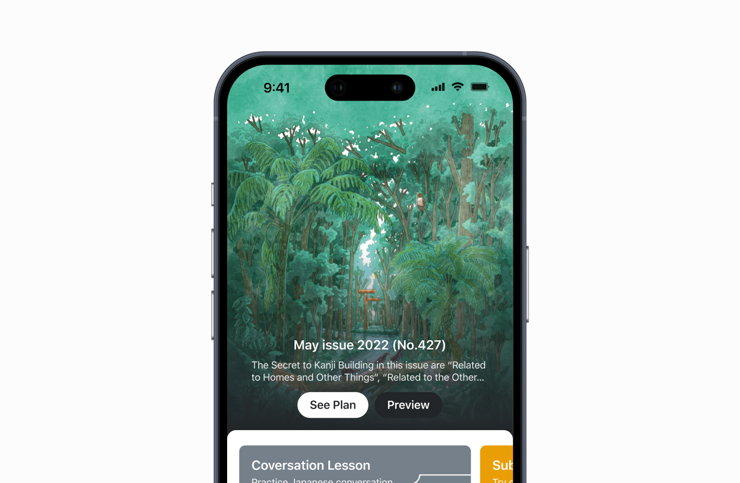
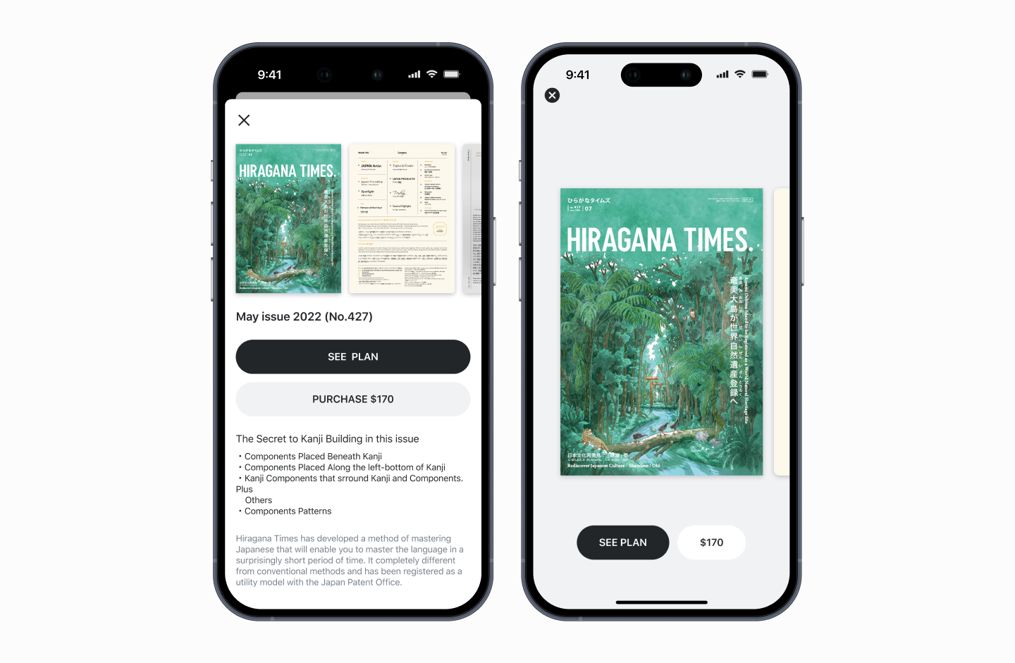
The magazine reading flow on the homepage prioritized single purchases over subscriptions, conflicting with our subscription-driven business model.